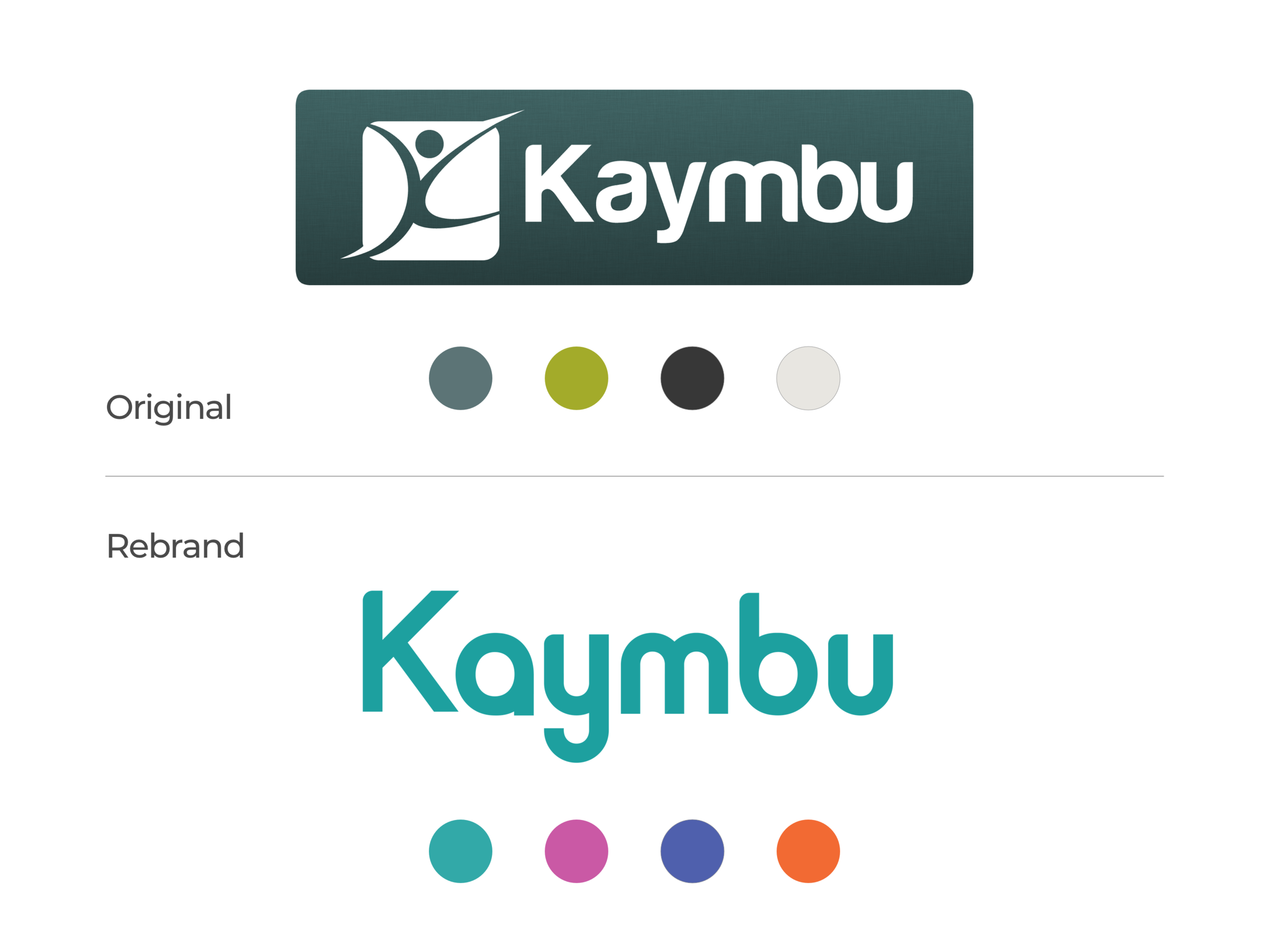
Kaymbu Re-branding
While re-branding the company we wanted to be sure that we didn’t stray too far from where the brand currently was but at the same time giving the company a fresh look and feel. This meant, cleaning up the logo and updating their core brand color to a fresher shade of blue as well as the rest of their brand colors to brighter, more fun, youthful colors to better reflect the early childhood education space.
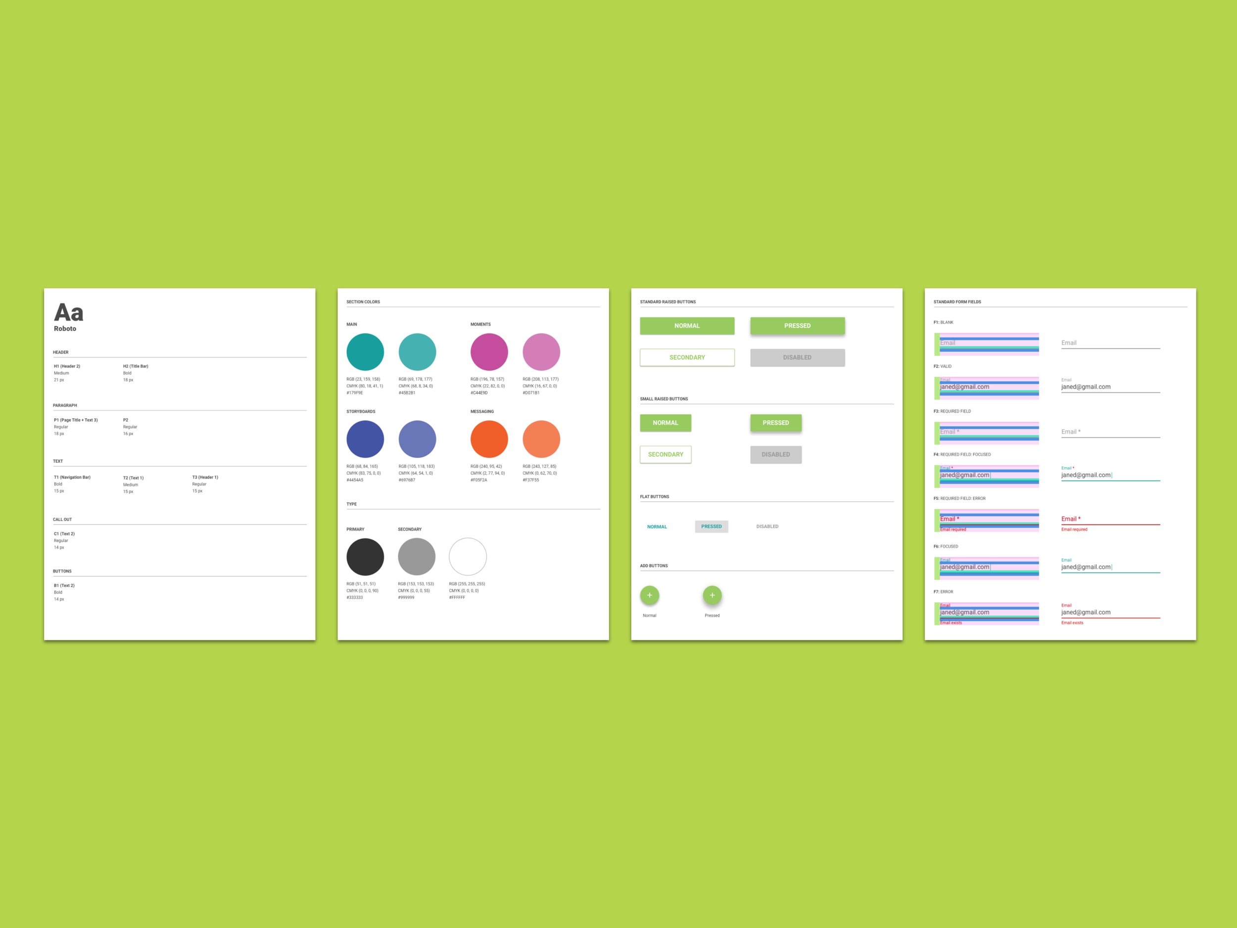
Based on the updated branding I developed a style guide to be sure we are staying visually consistent within parts of our core app and across our companion apps. This style guide shows a range of elements from colors, typography, buttons, form fields and more.
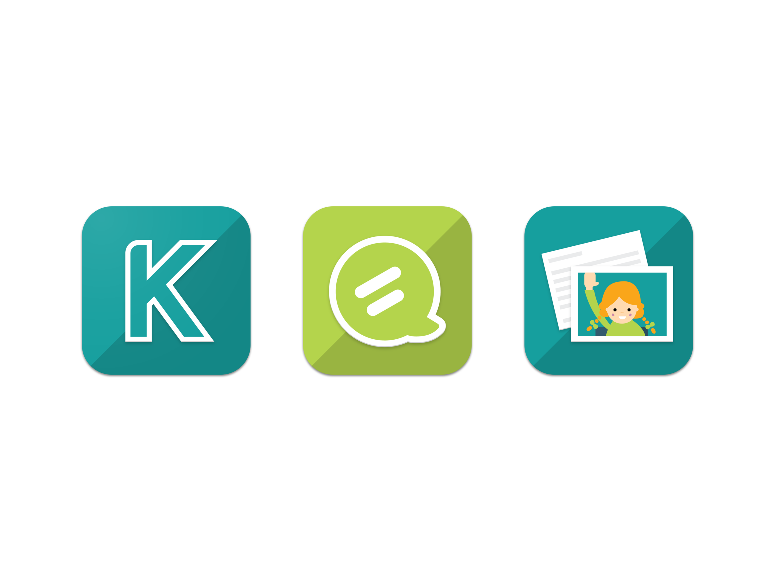
Once the re-brand was finalized, I used the new style guide to design an updated suite of app icons.